Tableau
Introduction
In the visual report part of this project, we used Tableau Desktop and Tableau Public, which are two products of Tableau company. We first finished the design of some data visualization in Tableau Desktop and then published the result to cloud-based Tableau Public. At last, we call a Tableau api to include the result in our ADSL web.
Student license version
Students can use Tableau(Student license version) for free for one year. After you get your Tableau Desktop, you can download the workbook(tra3) from my Tableau Public.
Study resources
Code
The following code shows how we call the Tableau API:
    <script src="https://public.tableau.com/javascripts/api/tableau-2.js"></script>

    <script>
        var vizDiv = document.getElementById('c2');
        var vizURL = 'https://public.tableau.com/views/TaxiTra2/TaxiTraVis';
        var options = {
            //height: '450px',
            //width: '700px',
            hideTabs: true,
            hideToolbar: true
        }
        viz = new tableauSoftware.Viz(vizDiv, vizURL, options);
    </script>
Report notes
We just use data of a week instead of a year to improve the speed.
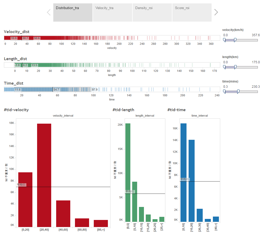
Basic data visualization

- The average velocity of trajectories is 30.7 km/h.
- The average length of trajectories is 6.2 km.
- The average time of trajectories is 54.7 mins.
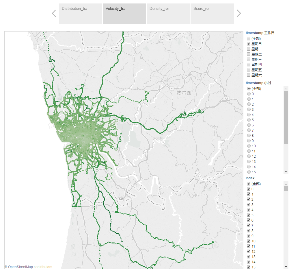
Trajectories velocity visualization

- The heavier green means the higher velocity.
- We can see that velocity in suburb are much higher than city center.
- We can choose the day of week and hour of day in the filter part.
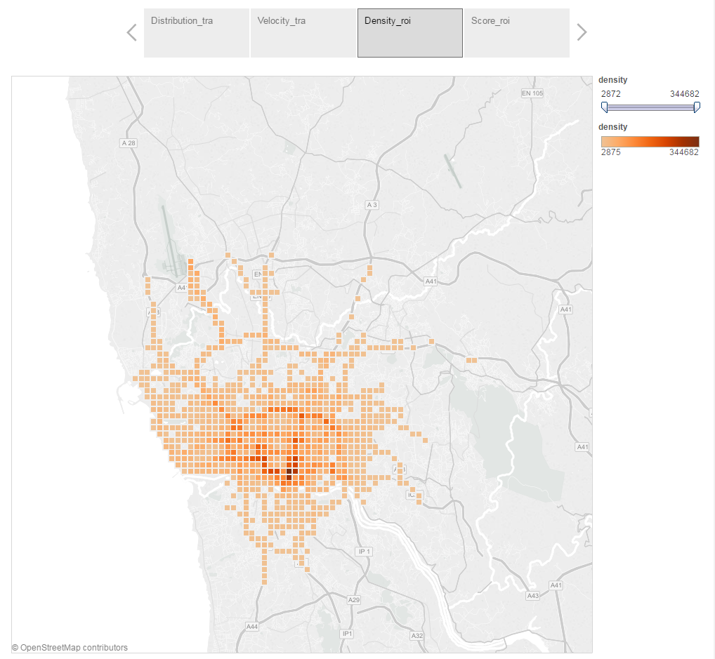
ROI density visualization

- The heavier orange means the higher density.
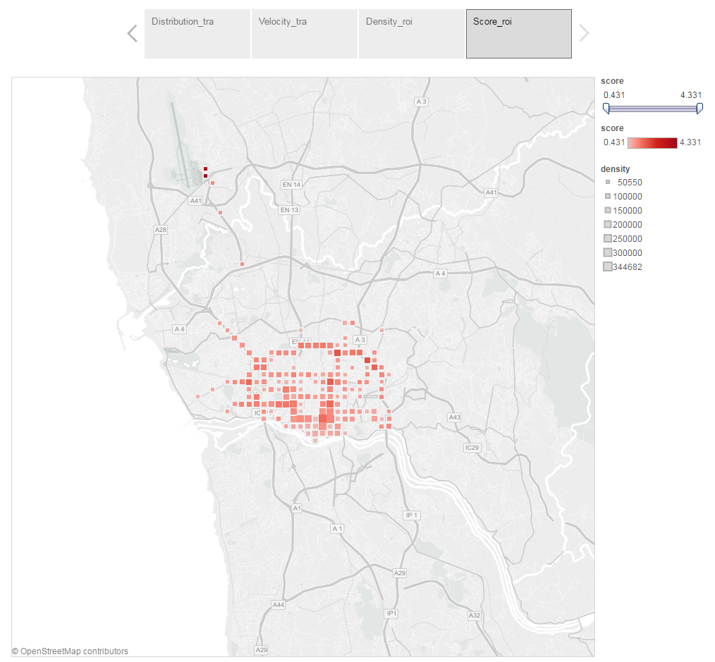
ROI score visualization

- The heavier red means the higher score.
- The bigger box means the higher density.